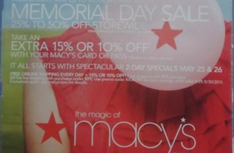
I often have disagreements with graphic designers over text sizes and the look and feel of print advertisements.Reverse type, which means that the background is dark and the words are in a lighter color, looks quite elegant – but it is hard for the reader to read. If a graphic designer gets free reign of how to design your ad, expect to see lots of white space, an elegant and modern design and probably some small sans serif text in some shade of gray.Sans serif fonts (sans means without) are fonts that are elegant and modern, as opposed to serif fonts, such as the font this column is written in. Serifs are the little feet on the different letters. The reason that virtually all professional magazines and newspapers use these fonts is because they are easier for the reader to absorb.The only time you should have a sans serif font or reverse text in your advertisements is in the headline. Because headlines are short, the human eye can process them without tiring. But preparing an ad with heavy reverse type or serif fonts is a major disservice to the readers of your promotion and by extension, hurtful to your own business – not to mention people’s eyes!CaptionsLet your readers know who or what is in your photos. Put a caption on every picture in your advertisement. It’s a simple suggestion, but one that will make your ad work better.While you may think, “It’s obvious that that is a picture of me, the owner!” (and that may in fact be true), the human eye looks for a caption. Your readers don’t want to work hard to piece things together from what they might have just read to decipher a photo too.Call to action
The most important item in any advertisement is your call to action, or what you want your reader to do after they read your ad. This means that whatever that call is, it should be simple and obvious. Your readers should know exactly what step they should take after reading the ad.You’ve gotten them to look at your article, drawn them in with your “hook,” so they are finding out more about something they are obviously interested in.Designers vs marketers
Many entrepreneurs and graphic designers don’t realize that if you have gone through all this work and spent the money to make the ad happen, you don’t want to leave them hanging and wondering what to do next. Make the next step easy to understand, in a large font, with a big phone number and contact information.Contact me
Giving your readers at least two alternate ways to contact you will generate more responses than having just one contact.Different people like different mediums of communication, so by giving both a phone number and an e-mail address you will capture different market segments.Ultimately the most important question you should be asking yourself is: What is more important to your goals, an elegant ad that wins awards for creativity and style... or an ad that generates new business for you and your company? When you can answer that question head on, it may be a bitter pill for the graphic designers with visions of awards dancing in their eyes, but the resulting ad will be much more musical to the entrepreneur’s ears.Show this column to your graphic designer. While their future ads might be a little less pretty, understanding and applying these concepts will ultimately give them clients who get better responses – and more money to spend on using them for more work in the future.issamar@issamar.comIssamar Ginzberg is a rabbi, businessman, public speaker and marketer. He travels extensively between New York and Jerusalem and has been published in more than 30 national business publications, including Inc. Magazine, which honored him with its Top 10 Entrepreneurs of the Year designation.
