
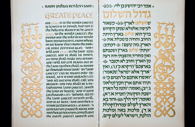
A Hebrew scribe – sofer stam – has a special status in Jewish tradition. The rules of the scribal arts are prescribed in Halacha with great exactitude; and yet, as Jerusalem calligrapher Izzy Pludwinski observes in his book The Beauty of the Hebrew Letter. “The scribe’s writing is not for show. The Sefer Torah he writes is put in an ark and is only taken out when there is a need to read from it. Similarly, the text of the mezuzah (attached to the door post) is rolled up and placed inside a casing so it is not seen, as are the tefillin parchments which are closed up in a box and not seen. This shows that all the stam objects are more or less kept hidden. The scribe’s work is best appreciated as much as when it is invisible as when it is seen. There is a certain humility about this – you’re doing this for it’s own sake, not in order to show off.”
This humility of the written Hebrew word is connected to its sacredness, which in turn is rooted in the mystical meaning given by tradition. A Hebrew letter is not just a symbol or sign. It has vitality, soul.
So, even after printing was invented, the rabbis insisted that the scribe continue to use the old ways. According to rabbinical tradition, Hebrew was the language with which God created His world. It is the means by which the world exists.
A new approach to the Hebrew language
In the modern world, the Hebrew letter has been taken out of its purely sacred role to become far more functional. The revival of Hebrew as a spoken language, especially in Israel, has much to do with this. The rise of a whole new profession of calligraphy artists, often with little or no connection with tradition, has meant a new approach to the aleph-bet.
This is clearly shown in Pludwinski’s book which, as its title suggests, emphasizes the aesthetic possibilities afforded by the Hebrew alphabet:
“In the international calligraphy world,” Pludwinski told The Jerusalem Report, “ there is so much going on in the lettering arts, Arabic, Japanese, Chinese, Latin, everywhere there is a revival of interest in calligraphy. I felt that Hebrew was not getting its due exposure. There’s been great Hebrew lettering throughout the ages, and I very much wanted the public to be exposed to it. There have been books on their paleography, on the development of the Hebrew script, there are also practical books on how to do Hebrew calligraphy. But there’s never been a book that focused on the beauty of the Hebrew letter. This book showcases beautiful works. I wanted to take the best that Hebrew calligraphy has to offer and show it to the wider public.
“Choosing who to put in and who to leave out was a bit awkward, since I know so many of the calligraphers personally,” says Pludwinski, a leading figure in the world of Hebrew calligraphy.
“I tried to be as ‘subjectively-objective’ as I could be. I didn’t want to put anything in that wasn’t up to standard. I wanted to show a wide variety, even styles that weren’t my personal taste but that showed a good understanding of the letter forms.”
What, though, is so special about Hebrew letters that necessitates a whole book on its aesthetics?
Pludwinski admits that it’s a question he struggles with continuously. “The answer is not so much artistic as something to do with the aura around these letters. There is a long held belief that there is something sacred about the letters; whoever is writing them shows a respect for the letters as such.
“We have a tradition that every little point in every letter has a meaning. So how do we reconcile these two different worlds – paleography and the rabbinic tradition?”
Here, Pludwinski raises his hand and bends it pointing downward: “There’s sacredness from above that influences what is below, and there’s this other sacredness that comes from below to influence what is above. The marvelous calligrapher Ben Shahn wrote that shape is content. It can’t be that the script that we use for the Torah are arbitrary symbols. We infuse meaning into the shapes of the letters. With each meaning, we’ve slightly changed the shape. A whole literature exists concerning the mystical meaning of the letters.”
Pludwinski worries about Hebrew calligraphy’s continuing importance:
“You have to find a new way of saying something relevant to your generation. If you want to print out a 12-point David font, you can do it; but calligraphers are trying to do more than that. The texts have emotional content, not just literal content. You’re expressing not only the text but something about yourself,” he explains.
“One of the extraordinary things about the traditional scribe is that each one has an individual style. Tradition decrees that the Torah and similar texts have to be handwritten, with all the human failures that implies. It’s not a question of what is on the page. The scribe has to have the right intention. He has to say out loud the words he’s about to write. What starts out as something very abstract – just a thought – becomes sound waves going to a more physical level. When he takes up the quill or pen, dips it into the specially prepared ink, his intention goes through the arm until he starts to write. From something completely abstract and spiritual, there emerges something material. It’s this connection that makes it sacred, which is not what you get in print. Without the intention, it’s not holy.”
Japanese Zen also puts an emphasis on intention, and it is not by chance that Pludwinski went to Japan to study the writing skills of Zen Buddhists. He had been searching for an authentic means of breaking out of the highly disciplined traditional Hebrew script without losing the feeling of sacredness that goes along with that tradition.
“That’s what led me to study Zen writing skills” he says of his experience studying under Zen masters of calligraphy. “I found in it parallels with traditional Hebrew calligraphy. There’s an idea in Zen of transcending the false ego, to get to a more authentic self. You become a vessel through which the letters flow, and that’s what defines strong and good calligraphy. It’s a matter of beauty, the process, the preparation, to reach the moment when you can write.”
Pludwinski recalls the time he spent at Roehamption College in England, where he studied English calligraphy:
“While there, I sometimes combined Hebrew and English lettering. Without fail, the lecturers and my fellow students would take what I had written and turn it upside down! That’s how it looked right to them; they saw it as an abstract design.
“When I returned to Israel, I started to look at these Hebrew letters in a different way. They were all square letters, and I began to look for a way of breaking out of this square-ness. At first, it didn’t really work, so I had to experiment a lot. Eventually I came up with the Shir font, that I used in my book of The Song of Songs.
“While I was at Roehampton, a famous calligrapher came to the college. He was a printer, a designer, a bookbinder; he built organs, he was a musician, a real Renaissance man. He critiqued the development of script in the Western world and said that Latin script was monotonous, especially in black and white. What might be good for legibility was graphically extremely boring. Every line is giving you the same visual information. If you compared that to Arabic calligraphy, you have something completely different in each line. No two lines are giving you the same visual information. In traditional Japanese writing, there is something different even within each character. It started me thinking about Hebrew. It came to me that it was possible not to have a mono-rhythm but a different movement. I got interested in the whole Japanese thing and philosophy. I started to work with a brush. I had to invent an alphabet using the Sumi brush. It’s supposed to be super sensitive and will show your inner self. Like the Zen practice of working on yourself, being in the moment and being aware of your inner-self rather than what you’re writing. It’s a question of how I’m writing rather than what I’m writing.”
“If you were brought up in America, Hebrew is a holy language. But for someone born in Israel, Hebrew is the everyday secular language. So is there a different relationship with Hebrew?
“What is the secular meaning of kedusha? I was invited to a meeting in Germany, where we discussed sacred letters or words. I was interested in seeing the idea of the sacred, outside the context of a religious meaning. I was hoping that this symposium would talk about what was sacred to a secular person. But the conversation didn’t flow. We were all talking different languages! Ultimately, I don’t think the secular person has this conscientiousness,” he says.
We discussed Ben Shahn’s design in 1952, using the Hebrew letters from a purely graphic point of view. Pludwinski wasn’t sure if he was the first, but he observed: “Ben Shahn calls it the Hebrew Alphabet, even though it doesn’t have all the letters of the alphabet.”
Yet he was very enthusiastic about the letters and adapted a mystical legend from Sefer Zohar, which he called “The Alphabet of Creation.”
Pludwinski’s book contains a wide variety of styles. Although he includes a section on traditional, sofer stam writing, the majority of the book is given over to innovative designs. These include calligraphy with pen and brush; carved letters in stone; letters produced on the computer; letters in black and white and painted in color. There is even a makeover of Michelangelo’s Hands of God the Father and of Adam, transforming the hands of God and man into Hebrew letters.
“The hardest people I had to deal with were the grafitti artists. They work in secret and didn’t want their names on any of their work. It needed detective work to find them. There is a whole group of artists in Haifa that didn’t want anyone to know about them. They were suspicious, but eventually they agreed to let their works appear in the book,” he says.
What of Pludwinski’s own pioneering efforts? Did he have any apprehension about including his own work? Asking around among fellow calligraphers, he was reassured that he should include his own work
The book, which took two years to complete, has been triumphantly received for showing the graphic transformation of the Hebrew letter beyond its purely religious use. Pludwinski is happy reviving the old but adding a new dimension.
“The latest things I’m doing is playing with letters and words, and I’m having fun,” he says. ■
- The Beauty of the Hebrew Letter: From Sacred Scrolls to Graffiti
- Izzy Pludwinski
- Brandeis University Press, 2023
- 228 pages, $50